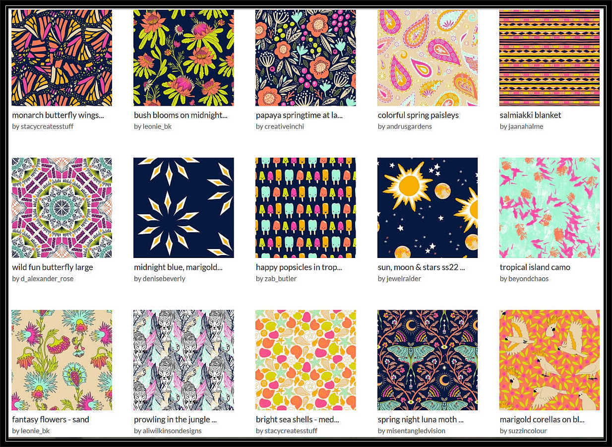
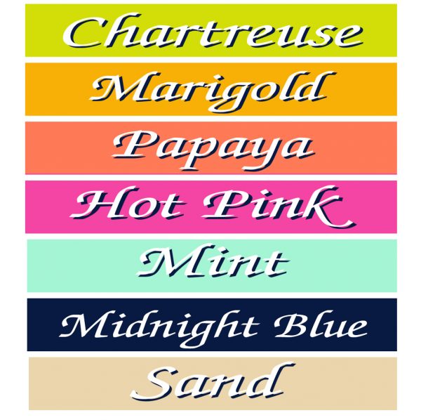
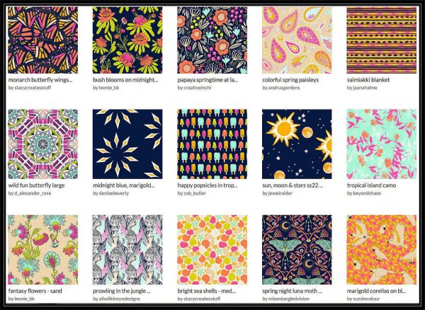
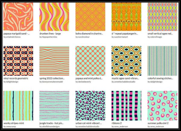
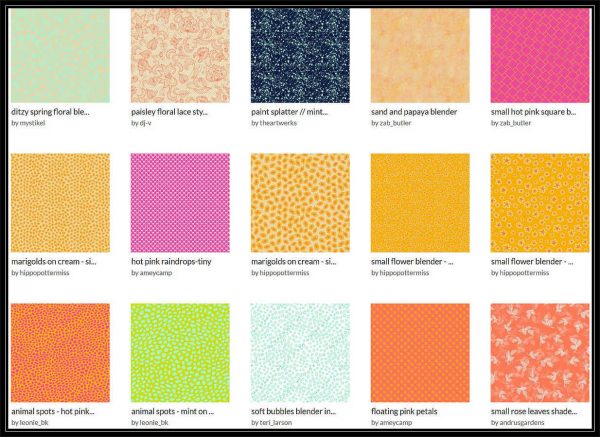
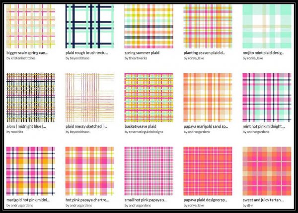
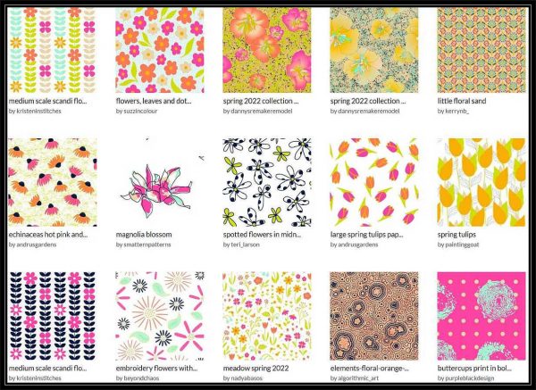
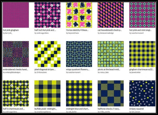
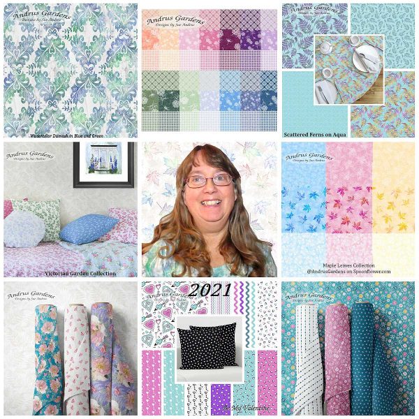
59 Designers from 14 different countries, created 1079 beautiful designs, using the same 7 bright Spring colors. Any of these designs can be printed onto various types of fabrics, wallpapers, and home decor items from Spoonflower.
The Color Palette
This Huge Collection is divided into sub-collections to make it a bit easier to shop. Images show a small sampling of designs in each of the sub-collections. Click on the image or description to go to the collections.
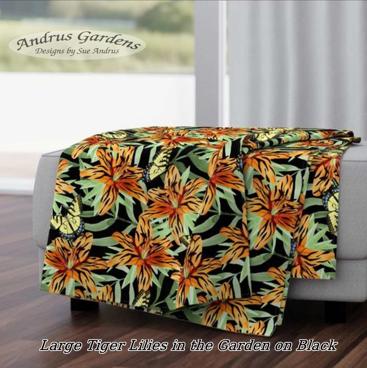
Two posts in a month!! Wow! Maybe this will be a successful restart…. This week, I entered my first Spoonflower challenge of the year. The theme is “Year of the Tiger”. At first, I thought I would skip another challenge, because I don’t draw animals. A friend mentioned that Tiger Lilies might work, so I dove in.
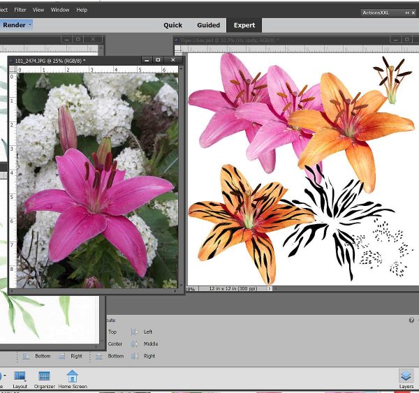
Lilies in progress
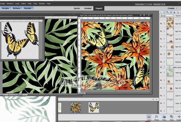
The above photo shows a bit of my laptop screen while I was working. I started out with a photo from my gardens of a pink Lily. Being not really fond of red or orange flowers, I have very few in my gardens to get photos of. I had to pull the flower apart after removing it from the background. The pistil and stamens ended up wacky colors while changing the pink to orange, so I pulled them out to color separately. It also wasn’t a true Tiger Lily, so I needed to add the typical spots they would have. After getting a nice batch of spots ready to add, I got the wild idea of giving my Lilies tiger stripes. At first, I wasn’t sure I’d go that route, but I tried them and they worked! I even manipulated the stripes I painted digitally to give them the look of fur. I layered everything together, and voila! Tiger Striped Lily flowers.
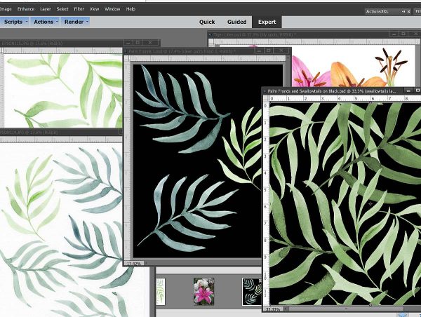
Watercolor painted Palm fronds
The next step was to add foliage. I found a photo with better looking leaves, and pulled them out to add to the flowers. Thinking a background of Palm fronds would look more “tigery”, I pulled out some fronds I Had painted last year. I updated the colors to fit with my Lilies better, and the background was done (after many, many hours of arranging and rearranging to get the repeat just right).
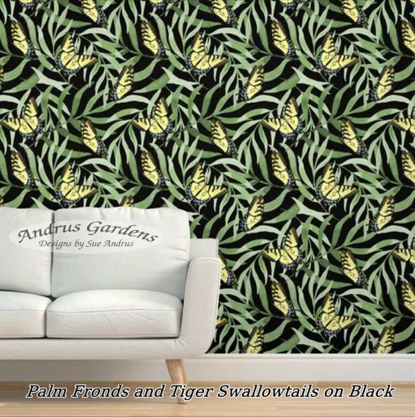
Butterflies and the finished repeat.
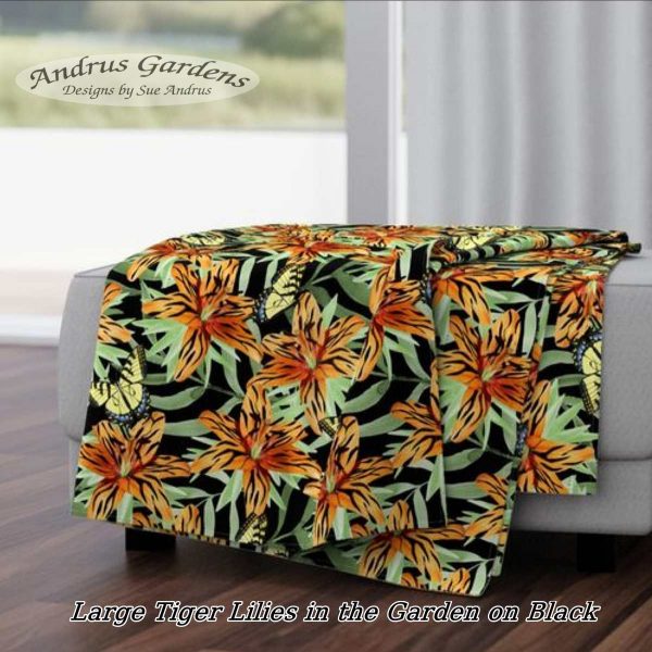
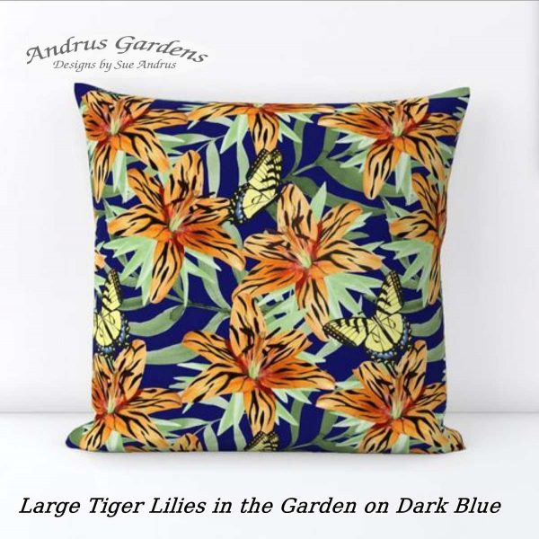
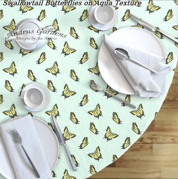
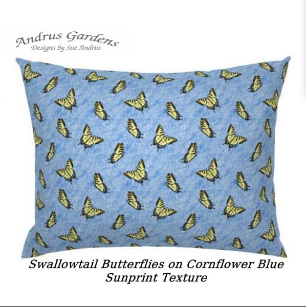
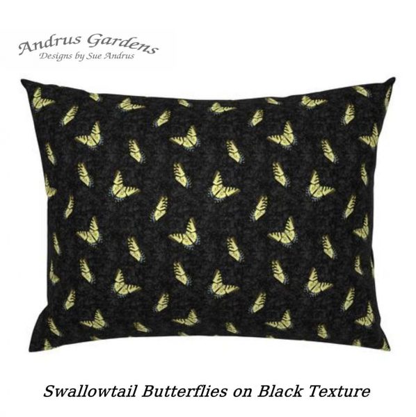
After adding the Lilies to the Palms, I felt something was missing. Then the thought hit… Tiger Swallowtail butterflies! I had an image I had pulled from a photo I took that was in black and white. I added the color back to them, and they were ready. Almost done… The last step was to decide the color of the background. Sometimes that comes easily, but it took a bit of trial and error with this one. I ended up with three versions that worked. The version I entered into the competition is the black background. I also have versions with aqua and dark blue.
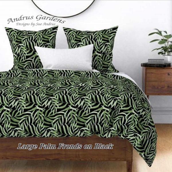
Of course, one main design is not enough to stop at. I needed some coordinates, so with a bit of rearranging, adding and subtracting, I ended up with two so far. I thought the Palms would look great on their own, which took longer to do than I expected, and ended up totally redoing the arrangement of the fronds. They were originally placed with the flowers on top. I also added more butterflies, and have a few color versions with them on backgrounds that I added texture to. The best thing about working in Photoshop is that if I keep everything on it’s own layers, it is easy to add, subtract, and color change things bit by bit. I have some texture layers I have made that I use in many different designs.
I’ll probably add a few more coordinates to the collection. Designs in the Garden Tigers Collection should be available for purchase on several types of fabrics, wallpaper, and home decor items by mid February, after I get the proofs ordered and back.
First post of the new year, now that January is over half gone… My how time flies! Last year, I managed to post a whole three times… maybe I’ll get better in 2022. I am getting a better start for sure.
My Beautiful Bella… I miss her so much!
Just before Thanksgiving we lost our Bella… Up until the end of June, she had been acting like a puppy most days. We had a wonderful 5 years with her… not long enough. She was 13 years old, and my constant companion indoors and out. Thumper, our cat, has now decided that he needs to take her place. He used to hang out with Ken most of the time, but now he is glued to me whenever I’m on the couch.
In 2021, I did a much better job of adding designs to my Spoonflower shop. My goal for the year was to add new designs regularly, and try to end up with 1000 designs available in my shop. I was able to hit and surpass that goal, with a total of over 1600 designs available by the end of the year! That meant I added over a thousand in a year. Many of the new designs were new colorways of some of my older ones, and lots of stripes, checks, polka dots, and other simpler coordinates. I also entered 19 Spoonflower Challenges. Those challenges usually sparked ideas for more new designs. I bought a new laptop last Spring, and that made a huge difference in how fast I could design. No more waiting forever while watching the little spinning wheel when saving or opening files. It’s amazing what I can do with the right tools.
A sampling of some of the designs created in 2021.
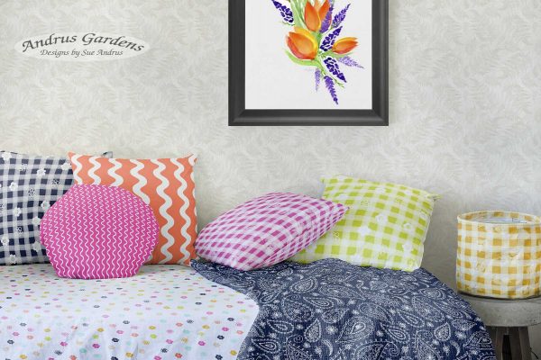
So far this year, I have made a pretty good start with new designs. Not many of the Spoonflower weekly challenges have fit with my style, but I am joining a group of Spoonflower designers in a collaboration of designs using a great, bright color palette for Spring. The colors we were to use are a bit brighter than I usually use, but I found them easy to play with. Here is a little sneak peek of some of what I have designed using the colors.
The designs in the above mock-up are part of my Spring Brights Collection, but not in the collaborative collection. Those will be introduced formally at a future date.
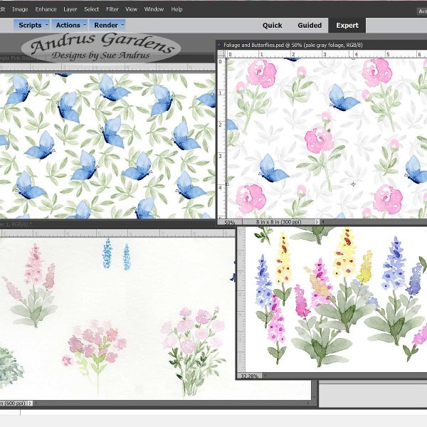
Currently, I have been working with some flowers that I painted in watercolor this past year. Since it it too cold and snowy to play in the gardens, I can play indoors on the laptop with flowers.
Foxgloves and Roses WIP
In the above photo, the lower left corner shows the original watercolors I am playing with. After removing the backgrounds, I did some recoloring of the Foxgloves. The Roses were painted to resemble a Peony in full bloom, but while working with the flowers, I felt they looked a bit more like Roses. The flowers needed a bit of an accent, so I pulled out the watercolor paints and now I have some pretty butterflies to add. These should be available in my shop by mid February, depending on how long it takes to get proofs printed and delivered. I’ll be placing the order by the end of this week.
Again, there are no guarantees of regular posts here, but this year’s goal is to post at least once a month. Baby steps are all I can plan on. I still never know how I will be feeling from day to day. I have learned to go with the flow, doing as much as I can on my good days. Here’s to a great 2022!
I love to create beautiful art using flowers, gardens and my surroundings as inspiration. Formerly an avid Art Quilter, now a Surface Pattern Designer, re-learning how to live and be productive with chronic illness.