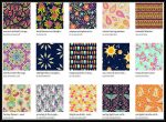
Posts Tagged ‘color’

In the Gardens Mid July

Wednesday, July 20th, 2011

There are still flowers on the Hemerocallis (Daylily) plants, but they are now beginning to slow down.  Since my last post, I made some interesting discoveries. The first was a nicely double flower on the variety Double Cutie.

Double Cutie Double Bloom

One of the stems of this variety opened flowers more double than the first blooms.  The one in this photo above was the most fluffy of them all… As you can see, the stamens in this bloom became petals, and they even have pollen like normal ones. One of nature’s wonders!

Another interesting discovery was with the variety Melon Balls…. One evening, I found all of the flowers were streaked with white and pale peach… I had not seen them like that before and thought it might have been caused by the sun or heat…

Hemerocallis Melon Balls Faded

The faded blooms were very interesting looking, and after a few days of stalking them, I found that it did seem to be the sun doing the fading. After a few days of finding streaked flowers in the evenings, I finally  got photos of the flowers morning, mid-day and evening… The more sun during the day, the more streaks there were by evening… What a great find! Flowers that changed as the day progressed!

Hemerocallis variegata

Also, as I mentioned in the last post, there was another double flower that hadn’t bloomed yet… It finally did, and here is one of the flowers. The original plant had variegated foliage, but most of my clumps have reverted back to green leaves. I will have to make an effort to dig out some of the remaining variegated parts to keep propagating those. The green foliage is much stronger growing, so it can take over if you let it keep growing. My clumps have been ignored a lot over the past few years.

OK, now that I have pretty much covered all of the Daylilies, there are a lot more flowers in my gardens. Other flowers that have been blooming this mid July.

Front Door Planter Right

In past years, my planters near the front door have been filled with flowers that I usually purchased early to have color out front as soon as possible. This year, I couldn’t afford to get anything new for the planters and I have had to wait for color this year. I had some extra plants left from planting this year’s Memorial Day planters, some white Petunias, Alyssum, and blue Lobelia. I had also been able to get some wave Petunias late June to add a few touches of annual color to my gardens. It is amazing what can happen when you don’t do anything more than take weeds out of planters with the soil left in them from the previous year.

Front Door Planter Left

This is the planter on the other side of the steps. The only new purchased plants in these pots are the White Petunias, Alyssum, and one Purple Wave petunia in the Left planter.  The Violas, Nicotiana, and tall purple Petunias in the Left planter are seedlings that came up from last year’s plants. The same plants and the striped Petunias in the Right planter are seedlings. I even was able to take out  some extra Petunia and Nicotiana seedlings to use in the gardens.  I LOVE “free” flowers! I had to be patient to see much color in the post, but they are now beginning to overflow!

White Asiatic Lily

Back to perennials in the gardens, here is a pretty rare sight… at least this year for me.  The mice and moles, or voles or whatever critters they were ate the bulk of  my Asiatic and Oriental lilies. These white ones are in the Maple Tree garden near the pond that is covered with black raspberry bushes.

Pink Lilies

This stem of pink Asiatic Lilies is one that lived through the critter snacking in the Back Yard Mound garden. This garden used to have gobs of Lily flowers mid July, but between the critters eating the bulbs, the water washing gravel on top of the bulbs, and snacking deer, I had one stem of pink and one stem of yellow blooms. The center of the Mound Garden used to be full of yellow Asiatics that would grow to about arm-pit height. I dug up some of the bulbs this year and moved them around.

Hostas in Washout Zone

This is the end of the Mound Garden where the Hostas have nearly been washed away or buried in gravel. It still amazes me how beautifully they bloom every year. The shade trees in the back yard are Black Walnuts and there are lots of plant that will not grow near them, but the Hosta and other plants I have here and along the stone wall have been doing great.

Mound Garden 7-8-11

This photo above shows the Mound Garden from the lawn at the top of the mound. Toward the right you can see the pitiful yellow Lily plants. The Echinaceas were just beginning to bloom when this was taken, and a couple Hemerocallis Ice Carnival plants were blooming between the Hosta and Echinaceas.Yyou can see the pale lilac Wave Petunias just beginning to grow a bit… I bought them late in the season and they were pretty long and scraggly, so I needed to trim them some so they will branch out and bloom better. I just have to have more patience waiting for the plants to fill out and bloom more. There is a Salvia Black and Blue with blue flowers with pale green leaves… My plants sat on a table out front of the trailer until I could get them into the ground and didn’t get fertilized like then should have been…. Yea, I was a professional greenhouse grower and don’t always do things right.

Back Yard Gardens from Wall

Here is another photo of the Back Yard gardens taken from the end of the stone wall closest to the Walnut trees, looking toward the new dog yard. Vladdi our son’s black Lab is standing at one of the gates hoping to be let free. He has helped my gardens a bit so far by getting a woodchuck who was teasing him from the other side of the fence. I let Vladdi out and the woodchuck was no more. The Hostas along the stone wall are doing nicely. The Mound Garden is to the right in the sun and hard to see. The wider part of the Stone Wall garden is just past the stone steps right about in the middle of the photo. On hot summer days, the shade of the Walnuts is wonderful.

Lady Fern

Here is one of my Lady Ferns tucked between one of my Krossa Regan Hostas and the stone wall. Last year the fern was pretty scrawny, but this year with all the early rain we had, it has done great.

Deck Planter with Back Yard in Background

Here is one of my deck planters with the Back Yard gardens showing in the background. The deck planters didn’t get many new plants this year either. The Nemesia in this planter was a gift, and the Petunias, Nicotiana, and Violet plants are seedlings from last years flowers. Some more “freebies”. I had so many baby plants coming up, I had to take a bunch out and put them into pots to be used in the gardens. The Petunias I had here last were plum colored with deep plum veins. This year I have shades of plum, pink and lavender Petunias.

Phlox Flame White with Eye

Here is the only new perennial plant I purchased this year. Phlox have done really well in all of my gardens, so I have been adding new colors and dividing my favorites to fill various spaces. The Flame varieties are shorter growing varieties than the older varieties. As with most perennials I buy, I just HAD to divide this one into two pieces and it is now a part of the Mound Garden.

Vinca Annual

Along with the lavender Petunias, I have also planted Impatiens in the shady areas, White Petunias along the front edge, and behind them are these Vinca flowers. I found these in a greenhouse I stopped at on the way home from giving a lecture to a quilt guild in Reading PA. I tend to “shop” my way home if I have a few dollars to spare. I also found these in a beautiful shade of pink. I only have 12 of the Vinca, but they should fill out quite nicely in the next few weeks.

Hosta Lemon Lime in Bloom

The last photo from the back yard for this post is this Hosta Lemon Lime tucked nearly under the Brunnera Looking Glass.

Hydrangea Anabelle

Back to the front yard, the Hydrangea Annabelle is blooming beautifully. These flowers last a long time, and look great with the Crimson King Maple as a backdrop. There aren’t too many small delicate plants in the Maple Tree garden… It is the largest garden and a great home for some pretty big and aggressive plants and shrubs.

Carpet Rose

Not too far from the Hydrangea is one of the few Rose bushes I have. This is a Carpet Rose that is a low growing variety that blooms on and off all summer.

One Tomato Left

Not all plants in the gardens ind up looking good. Even though I sprayed the Tomato plants with deer repellent, they still got munched on. I bought 3 nice sized plants that had Tomatoes started and this is the only fruit left. Since this photo was taken, they are all growing much better and look like they will do well if I can keep the critters away from them.

Poor Harry

Here is another victim of critters. This poor Red Leaved Harry Lauder’s Walking Stick was beginning to put out some new shoots after being chomped by deer over the winter, and the new shoots were eaten… There are still some shoots trying . I have put more repellent around this and hope it can get growing again.  It has reddish leaves on twisted branches.

Monarda Summer Wine

Here is a closeup of a Monarda (or Bee Balm) flower. This variety called Summer Wine is a really pretty bright fuchsia wine color. This is near Harry, on the end of the Maple Tree Garden with the arborvitae. I used to keep this area for annual flowers, and am slowly adding perennials here. I have planted more Wave Petunias in this garden and the Purple Wave’s that are planted near the Monarda are nearly the same color. So far not much color yet from the Petunias, but in a few weeks if the weather cooperates, I should be able to see them from my kitchen window.

Evening Sky

Again a post is getting pretty long…. Here is a photo of the sky one evening, looking through the Maple Tree garden. The left round tree is the Crimson King Maple. The Monarda and Harry are to the left not shown in this photo. You can just make out the Hydrangea flowers along the lower center of the photo. The Maple trees, Balsam Fir (center) and Junipers are getting pretty big. It’s amazing to think that less than 20 yrs ago these all were pretty small trees from a nursery I worked at back then.

The great thing about the gardens is that there is always something new popping up or beginning to bloom. There will be more posts from the gardens…. the Echinaceas and Phlox are beginning to really come into bloom now.

After the Washout…. Dye Update

Friday, July 9th, 2010

Now that all the fabric I dyed last week has been thoroughly rinsed and then ironed, I know what I have to play with and what will need some more work.
As you can see in the photo above, that all was not lost… far from it!! I ended up with some pretty wishy-washy colors, but there were some very pleasant surprises.  After some comments made and information from others, I am not tossing my dye concentrates yet… I will give them another try, but this time give the fabrics more hours in the soda ash soak. I only left these an hour or so because I was in a hurry.   Here is what hurrying got me:

Shibori 1 fresh

The above photo is the only one taken of what any of my fabrics looked like fresh out of the dyebath after only an initial rinse. It was really striking with the rich, deep colors, but as I began to rinse, more and more of that beautiful color left….

Shibori 1 Ironed

The piece still has some great patterning, but is nothing like it first looked. The golden yellow stayed the best because it was the only freshly  mixed dye I had used.

Fat Quarter Clean-up

One of the clean-up fabric pieces… not much color left….

Shibori 2

I think this is my favorite piece…. I love the soft colors and the way the fuchsia faded to a pale rose into the green. Very sky or water-like…

Blue Purple

This one kept quite a bit of color. I love the icy patterns that I got.

Lavender Blue Narrow

This one is even icier with less rose tones and touches of greenish blue here and there. This is a 2 yard piece that I cut in half lengthwise… I thought it was only one yard, but now I have a long piece.

Dark Green

This was supposed to be a deep, dark green… it still is green, just more of a seafoam shaded piece. I wanted some pieces for mountains, but got seashore instead.

Another Green

This one held a bit more yellow…. still lots of patterning.

Minty Green Tone on Tone

This is another green… more “minty”, and this started as a white on white print… I have two sides to choose from :)

Multi Half Yard

This one really surprised me… I was amazed that the black that I watered down before putting it on, stayed much better than I expected. This was expected to have much darker fuchsia. I had tried to get these colors and patterning on purpose in the past… I got it by accident… A happy accident…

Soft Pastels

One of the more “wish-washy” pieces. This will be used for sunprinting, or may be cut up and used for skies….

Pale Blue Tone on Tone

This one is really pale… Another white on white, so I have two sides to choose from. Not sure if I will do more, or leave it to use where I need just a touch of color.

Mustardish Piece

Any better description?? This one reminds me of something that the mustard bottle blew up on… Probably my least favorite, so this is in line to be overdyed or painted. This is the piece of fabric I placed in the bottom of the bucket that Shibori 1 sat in, so I could catch all the drips…. very sad pale blue and mustard….

Small Pieces

A random few smaller pieces. Most that I did were one yard pieces, but these are fat quarters and a half yard. The fat quarters were clean-up “rags” and I am still amazed at how much the black stayed around…. that golden yellow did great… the difference fresh dye makes.  This dye session was a real learning experience, but gave me a lot of great usable pieces. I will have to play with soda ash soaking things much longer to see if I can get more color from the old dyes… I hate to toss anything out if there is any good in it….

Tall Pink Lily Flower

I gotta add a couple flowers… This Lily is taller than I am, with gobs of flowers. It smells wonderful!

Hosta Sweet Tater Pie

It looked like a spotlight was on this Hosta, with the sun beaming through the leaves of the trees in the back yard. It has bright lime green leaves which look even more yellow in the sun.
I need to get back to the studio… I have a group of postcards in the works…. Photos when I get more done…

Color in and Out of The Studio

Tuesday, April 13th, 2010

I finally have gotten back to my studio for a little bit, scattering lots of colorful fabric pieces. I began a new project of making covers for various sizes of notebooks, journals, and brag books, from mini to more standard sizes. I have been using some of the fabrics I dyed last month along with sunprints on hand.

Pretty Pile of Book Covers in Progress

The colors remind me of some of the photos I have been taking of t he Spring flowers in my gardens.

Snow Glory Group

The first flowers to pop up in my front yard garden were the Snow Glories, My favorites because of the bright shade of blue- like a summer sky.

Deep Midnight Blue Fat Quarter

This fabric has lots of shades of blue, including shades similar to the Snow Glories.

Winter Aconite Blooms

These little Winter Aconite flowers opened up even while the foliage still looked frozen. These hide in my shade garden in the back yard, near the stone wall and bloomed even before the Snow Glories.

Japanese Pine with Snow

Even this plant does not have flowers, it looked so pretty with it’s last coating of snow for the season… almost flower-like. I love the look of the branch tips against the blue sky.

Blue, Green and More Dyed Fat Quarters

These fat quarters were scrunched in the same container. The shades of blue and green  with touches of yellow and fuchsia remind  me of gardens full of blooms.

Pulmonaria "Mrs. Moon"

These little beauties sometimes sneak into bloom and are nearly done before I see them in my back yard garden. I caught them just as they were opening their first buds. I love how they change from pink to blue as the flowers age.

Yard of Bright Dyed Fabric

The above yard is one of the brightest that I ended up with, using fuchsia, cerulean blue, and yellow.

White Daffodils with Yellow Centers

These Daffs seemed to bloom much sooner than usual with the warm, summer-like weather we had early.

Double Daffodils

These were not in my flower beds, but I wish I had some… They were in bloom on Easter Sunday…. So beautiful!

More Fat Quarters

This group of fabrics show another bright fat quarter with a soft mauve one and a pair that were done with the same colors.

Almond Tree Blossoms

These are still open, but I caught them at their peak for the photo. The almond tree is covered with these pink flowers this year.

Light Blue Fat Quarter

This fat quarter isn’t exactly the shade of the skies in my photos, but it is pretty and soft.

White Grape Hyacinth with View

I caught this little clump of white Muscari, or Grape Hyacinth, while in bloom. They are in my huge Maple tree garden and I usually miss them while in peak bloom. I was able to get the distant view of the mountains in the background.

Jenna in Easter Dress

This little “flower” is the hardest one to photograph… she doesn’t stop moving- granddaughter, Jenna.

Mini Composition Cover- Lavender Geranium

Here is one of the finished covers. This one is for a mini composition book. The size is just right for tucking into a purse and makes a really pretty way to dress up a little memo book to keep lists, ideas and more. Available in my Andrus Gardens Gift Items Studio on Artfire…. Link to Geranium Cover.

Play With Chalk and Paint

Saturday, August 23rd, 2008

This post is a bit later than planned, but the past few days have been a  bit busier. Note to self— Don't even pull one weed without gloves if you have a history of breaking out in itchy blisters. I found many perennials buried in the weeds at work, and decided to give some Hibiscus plants a break, pulling just a few weeds out from their pots and surrounding area. I then didn't think to wash my hands after doing it, and now I am paying the price– fat, red, itchy fingers– It's not the first time, so I should know better. Ice packs are wonderful things!

Now to the fun part…. I played with my chalk pastels a few days ago. The weather hasn't cooperated with sunprinting, so I decided to use the breezy, humid weather for other paint play. I learned about using chalk pastels with acrylic and textile paints from my workshop with Elizabeth Busch this summer. The chalk stays put when used with the paint, when the paint dries the chalk  doesn't rub off. I got some great effects, and got myself a larger selection of pastels to play with. Irises are one flower I have used in my quilting a lot, but they don't do well for sunprinting. They are great subjects for the chalk!!

I am better at just "slopping paint on fabric, then letting nature help me do the details. Amazingly, I just started to draw the Irises onto the just painted fabric and this is what I got! I love the lines of the grassy foliage, and started there, then "scribbled" the flower shapes and kept adding bits of color over, and am happy with this first attempt. The one thing I need to remember is that since I am working on wet, painted fabric, that the pastel colors look much darker as I am applying them. The darker purple I originally tried, looked too black so I used the lighter shades. The middle group nearly blend in with my background, but that is how you find what works and what doesn't– lots of play!


 Another thing I did that I don't normally do, is to stack 2 pieces of fabric on top of each other to see what I would end up with on the bottom piece. For this I used a more open weave fabric than I usually use. The photo here shows the 2 pieces together.

A lot of the chalk did go through to the second piece. The green for the leaves shows the most, and the lightest colored flowers in the middle are very faint. I will have to try again with the tighter weave fabric I usually use. I don't know if as much will go through.

Here is another set of "twins". I tried for a landscape look, here. I think I really like the under piece better than the top one. It is interesting how the greens transferred through.

 
 Here is another landscape type piece. I was trying to get the look of a pond with grasses growing around it. I used sea salt on the green area for a different texture.


And last for this post is the pastel rainbow. I combined the paint, pastel, and sea salt for this one. After finished, I wished I had tried the stacking idea on this one- I'll have to remember to try it some other time.

It felt good to be back to my more cheerful colors to work with, instead of the "rocks and mud" colors I have been using so much of this summer.

One good thing about the rocky stuff is that the journal quilt I entered into the Houston show was accepted!!

For something I wasn't even thinking of trying to enter, it just happened and ended up being one the jurors wanted. Now everyone will have to wait until late October for the unveiling of the whole piece. The sneak peek is here. You'll have to scroll to the end of the post.

Now back to a fresh batch of sunprints!! I actually got some done yesterday. I just need to finish heat setting them. I will show some in another post.

Read and post comments | Send to a friend

Color Play- Updating Some UFO’s

Monday, August 18th, 2008

Being challenge leader for the Color Play challenge for the Janome6500 Yahoo group, I have decided to pull out some old UFO's to see what will happen. In the earlier post, I showed photos of some of what I found. I began to play with 3 of them, and here is what has happened so far.

Here are the photos of my first subjects. The little "blahhh" hangings are small pieces I used to make and sell at craft shows. These two didn't get finished for some reason. The one with the butterflies didn't even have the quilting finished, and some of the blue markings are still there.

The star and paisley wall hanging top was another of a series of hangings I sold regularly. This one never got finished probably because I had moved on to other things or that style of hanging wasn't selling as well. I know that I would not use that paisley fabric in anything I do now.

There is nothing I can do to hurt any of these, so there is no pressure to end up with a "masterpiece". Great pieces to try things I would not have otherwise tried.

 
I usually paint on plain white fabrics, so this is a bit different for me.

For this little piece, I thought it mainly needed more color. I began with my colored pencils and colored in the flowers like a kid with a coloring book.


   After coloring with the pencils, I added a layer of diluted Super Sparkle textile paint over it to add some glimmer and to keep the color in place. I then added touches of yellow and white chalk pastels to add more interest onto the wet paint.


I also added different shades of green pastel to the leaves. This piece definitely looks different from it's beginning, but it still needs something- more quilting…

  This is the result after the quilting with clear thread in the background. I still am deciding as to whether I will add a hint of color behind the flowers or not, but this one is done for now. I will probably trim the edges neatly, and add my usual couched yarn binding. The pillowcase finish on the edges here are a bit ruffled.

Next is the butterfly piece. I didn't even finish the quilting to outline the butterflies, so started with a quick drawn line with blue pencil, then quilted with the clear thread.

The quilting lines will give me an outline to color in.

Here is what I ended up with after coloring and painting this one. As you can see, I got a little carried away with the sparkle paint on the border. I quilted my favorite vine-leaf design in the border, then filled in the leaves with the watered down sparkle paint. At this point, this piece looks a bit too busy and gaudy. I will be adding more with colored pencils or pastels to tone down the border. I may also add some more definition to the designs in the wings of the butterflies. This is the perfect way to find out things that DON"T work!

I decided to try over painting the paisley fabric on this piece. I no longer like that particular fabric, so I started by painting over it with diluted Lumiere gold paint. It gave the fabric a bit of an aged look, but was not enough to cover well. I had wet the fabric first, and with thinned paint coverage was not good. I then pulled out my new set of chalk pastels and found a color that would compliment the center star blocks. I scribbled over the paint, and ended up with a more distressed look.

The center of the piece now looked too bright, so it got the same gold metallic paint with a bit of the pastel over the paint on the white areas. I liked what was happening with the star squares, so just left them with paint only. This photo shows some lines of the pastel color on the white fabric. I brushed over them with my paint brush to blend the colors better.

The next morning all was dry (biggest problem for me doing this, is waiting for things to dry- I had to work inside due to the weather- not too patient a person). As you can see, after the paint and pastel dried, the chalk shows more than it did when wet. This photo also shows the other big problem with this piece- there is a lot of wrinkling in the white areas due to my stretching the borders as I stitched them on. I plan to do a lot of close quilting in these areas to "suck up" the excess fabric. I will do minimal quilting on the borders and just a bit more on the stars. This piece, like the other 2 may be mounted to fabric covered canvases for display. I'll see what develops as I continue to work with these.

Well, back to the studio for some stitching. Updates will follow……

Read and post comments | Send to a friend

Inspirations and Projects Old and New

Friday, August 15th, 2008

I'm getting a bit  better with this blogging, just over a week since last post. Since then, I'm a year older, attended a weekend long family reunion, spent time with grandkids plus one, and attended my quilt guild's annual picnic at Round Top Park- a park between home and the NYS border.

This was the first year I have attended that I was able to get photos of the spectacular views of the surrounding mountains. Each of the past years, the weather didn't cooperate for photos- rain, thick haze, etc. Last year, I couldn't see beyond the trees in the foreground- the valley was completely blanketed in white. The view from here shows the Susquehanna river on the right. This photo was taken about 4PM when I arrived at the park. The Susquehanna river is to the right, and you can see parts of Sayre and Athens,  PA, in the distance you can see New York State.

Here is a similar shot taken just before I left the park at about 7PM. The lighting is different and the mountains in the distance are much hazier looking.

  This photo shows a wider view, the high school that my boys attended is just left of the lower center. I love the way the sky looked when I took these last photos. I have been playing around with my chalk pastels more since my workshop with Elizabeth Busch at QBL. I am working on a series of pieces depicting the mountain views from my deck and fields at home, and where ever I am travelling. I have been working with the pastels on bleached 7 oz duck, then I will add paints over the pastels. A bit backwards from what  we did in class with pastel over wet paint. I need to work on getting the perspective right to show the great distances I can see to show. I will post photos of what I'm doing with that in a later post.


Here are some photos of a few UFO's I dug out. I am hosting a "Playing With Color"  challenge through Sept. on a Yahoo challenge group. Members are being challenged to pull out all those art supplies laying around the house such as paints, crayons, colored pencils, pastels and more, to see what they can do to change the look of fabrics. I am challenging myself to take some old UFO pieces and change or add to them by painting, stamping, drawing, or more to see if they can become something better.

Here are a few pieces of fabric I pulled out to play with one day. I am also playing with printed fabrics instead of just  the white I usually paint. I had just gotten my supplies outside to work when my son arrived with our grandson and his cousin (4&5 years old). As soon as they saw I was going to play with paint and fabric, they wanted to join in, so I set them up with their own pieces and some paints and stamps. They had a great time… I got nothing of my own done. By the time I got the kids started, the wind started blowing and I got tired of chasing things, so packed it all back in the house. I had taped things down for the kids, so they kept on playing while I put things away.

   Here are a couple of old small hangings I used to make and sell. The center designs were free motion quilted with colored threads, and "framed" with other fabrics. These never quite got finished- the top edges didn't get closed after pillow case turning them. My plan for these is to add color to the flowers and butterflies with paint or pastels, and maybe even add to the borders with some stamping or something else. Not sure what will happen.


The photo on the left is a smiling 10 wk old, grandbaby Jenna. It's hard to catch the many faces a baby makes with a slow digital camera, but I got a few great ones.

The right photo is from my sister's gardens where we had our family reunion. I keep taking as many photos of flowers with the sky as I can find. We were lucky and got great weather for the reunion- cool for August, but not too cool, and the rain held off for night.

Here is another work in progress that I pulled out again. It has a photo of the old house along our road that is nearly falling down, and surrounded by scrubby bushes and weeds. I used the photo printed onto cotton to start with for this piece. I used the photo as the inspiration for "My Dream House", but turned the house into an English cottage for that one. The link takes you to the post about the process for the piece.

In this piece, I wanted to show what the house would look like surrounded by beautiful blooming gardens instead of weeds. I've often thought of this when passing by, so this is what I have so far. I'm still working on the large tree trunk to make it fit in better, and am adding some embroidered flowers to the bushes at the end of the house.

The final photo for this post is a little sneek peek of my journal quilt. I wasn't even going to try to do one this year, but this  just kind of happened. The green fabric is from my Elizabeth Busch class, and I have also used some of my "rocks and mud" fabric for some textured "rocky bits" like I played with in my Rosalie Dace class earlier this summer– truly a journal of what I've been doing since spring. I won't be able to show the whole thing until IQF in Houston, unless it is not accepted- my fingers are crossed…

Read and post comments | Send to a friend

Posting From the Road

Thursday, July 24th, 2008

Well, here it is…. my first post from the road. I'm finally learning how to use my new laptop computer. Right now I am at Morrisville College in NYS, at Quilting By the Lake (QBL). I was honored to receive a scholarship to attend a 5 day class here. It's like being a college student again for a week. We are staying in the dorms and eating in the dining hall. Wonderful food! I'm taking a class from Elizabeth Busch- Small Works. I am learning so much and having a wonderful time. I really neded to get away, and this has been just what I needed. We began on Monday, and have not used our machines yet. We have spent our time so far painting fabric. OK, anyone who keeps up with me knows that I already do a lot of paintng, but there are so many new techniques out there. More tools in the toolbox…. New ways to think about paints and fabric.
 

Here are some of the pieces I have done. We are painting on a light weight canvas, which is very different from the cotton I work with. I have used a bit of cotton to catch the drips- can't waste any of the beautiful colors!

Here is another view, showing some other pieces, with the 2 least favorites removed. After taking this photo I did a bunch more pieces– I hope they will be dry this morning. With rain every day, and warm temps., the humidity does not make for great drying conditions.

Today, we begin cutting and composing some small pieces. The machine will come out, and I will see what will come from what I have produced along with what I have brought with me.


Here are a couple sunprints from my last painting session at home. I finally got a day that would work for printing. There have not been too many this summer with all the humidity.

Well, time for breakfast!! Did I say the food here is great?  Then on to class– more photos later of my progress.

Read and post comments | Send to a friend

Fabric Painting Again, Finally!!

Monday, July 7th, 2008

I finally took some time for painting on fabric. The first for the year, Wow, late start for sure.


For some reason, I have decided to try more mixed groupings of leaves and flowers. It is a bit trickier, since this piece shown in the first 2 photos was a full yard of fabric. It takes a while to get the paint on, then add the leaves and flowers, etc. All has to be placed before the drying starts. To do full yard sizes, I put the fabric directly on my large, sunny table. I have a 4 ft. square piece of thin plywood somewhere, I need to find it, then I can paint in the shade of my new tent area. My other worry with this yard was that just as I finally got the leaves, etc. on, the sky got dark, like a storm was brewing. Not good for sunprinting. Luckily, most of the prints came out OK. I did get in a bit of a hurry, and due to high humidity, the fabric under larger leaves had not completed drying after nearly 2 hours, and have some dark centers.

I played with squirting on yellow paint from a small bottle, instead of brushing it on in some areas. The effect in the lower piece, especially, made some neat effects.  The next time I try this, I will have my materials ready better. I was digging through my pressed leaves in paper, while the paint was trying to start drying- lots of spraying with water to keep things wet.

The mud and rocks are back, too. I still have pictures in my mind of the rocky roadsides, and played with these two pieces. I painted the deeper colored one on the left, first then added some green and gold metallic. I then added a dry piece of fabric placed over the first, brushed the rose onto the top (back of piece #2) and pressed them together while brushing. I then scrunched and lay the pieces separately on the rock pile in our side yard that was to house a swimming pool. The lichens on the rocks helped to make some neat patterns.

I'll see what happens today, still humid, but sunny.

Read and post comments | Send to a friend

Colors…. Some Rambling Thoughts…..

Saturday, January 19th, 2008

This morning when I came to the computer, I found a little questionnaire from someone on the Janome 6500 Challenges Yahoo group, about colors- what our favorites, etc. That really got me thinking some more, so I decided to jot down some more thoughts here. They may be a bit random, but what popped out.

Sometimes, I have thought of myself as somewhat of a "Color Junkie". Certain colors, or combinations of colors really fascinate me.  I prefer more mottled and blended colors over flat solids. I love the depth that variations in shades, tints, and tones of colors give a piece of fabric. It doesn't even have to be fabric. I love the color of my cobalt blue wine bottles, perfume bottle and a casserole dish my mom gave me. The casserole dish is too pretty to use- great to stare at, though.

I began  painting my own fabrics after searching for just the right shade of blue. Actually, I began by playing with dye, but you need more water than our well has, so paint became my preferred way to color fabric. Mickey Lawler had a lot to do with my fabric painting, after getting her book- Skye Dyes. There I found out about the amazing process of sunprinting, hiding on a few pages there. I have a fat quarter of one of her fabrics hanging on my office wall, to just stare at. So many little details in the way the colors of paint reacted with each other before drying.
As anyone who is familiar with my work can tell, I like mainly cool, soothing colors, and red is a color I rarely use.


Having a degree in horticulture, and playing with plants and flowers has possibly affected the colors I like, though I don't ever remember liking red, I've always been a pink person. There are many flowers that are said to be red in color, but are really more of a cherry, magenta, or cerise. I do like these shades of red, as they are on the pink or blue, cool  side of red (more like pink), and not the warmer, orange side. My least favorite flower is the red geranium, used so much for Memorial day planters. Of all the thousands of geraniums I have grown over the years, I really only liked the "colored" ones, or anything that wasn't red. There are great varieties in shades of pink, lavender and fuchsia, and more. While doing my Journal quilts in 2002, I decided to pound a red geranium flower on my May quilt, and found that there is a little good in the red geranium- the color released was a purplish pink.

Typical English cottage gardens, with Delphiniums in all shades of blue,  roses rambling in shades of pink, foxgloves, hollyhocks, irises, and daisies, and more, are my favorites. As with "My Dream House" there are lots of purples, and blues, with pinks, white and small touches of yellow. In my gardening as well as my quilting, I don't use much red. When beginning my front yard garden, a Daylily bloomed with reddish orange flowers, and it was promptly dug up and tossed into the woods, where it has multiplied happily, bringing a bit of color where would be none, but away from my pinks and purples. A bit of or orange is creeping in with the newer varieties of Echinaceas. The flowers of these are not totally orange, but have lavender or purplish undertones to the orange color. A couple others with great foliage colors and, or, textures are allowed with golden yellow to orange flowers.

Back to color in fabrics, I tend to get "sucked into" pieces that are combinations of many colors, allowed to bleed into each other, creating new colors. Many times looking closely at a flower or leaf, I find color combinations I have not tried myself, and immediately think- OOooh, I have to paint a piece of fabric like that. I guess that is why I tend to paint my fabric with more than one color or shade of a color. I love to see what happens when different colors are overlapped. My 3 basic paint colors are a deep blue, deep green, and a purplish deep rose pink. I began by painting most of my fabrics in just these 3 colors, I guess representing sky, grass, and flowers. I have been playing more with adding touches of yellow. I love the peachy tones between the rose and yellow, when they are overlapped. With sales in mind, I have also added some orange to my painting. I needed the brilliant fall colors, and really shocked one of my sons, when he came home to my tent with many pieces of orange fabric hanging from it.


To help add more texture to my fabrics, I have been using a lot of sea salt, and have played with my fabrics while drying to achieve more interest. The salt is so unpredictable, that it is always a wonderful surprise when it's work is done, leaving deeper and lighter areas of color, or pulling one color more than another.

I have found when it comes to color, my favorites will help to calm me, or make me feel happy, while my least favorites will cause an uneasiness. When I find something- fabric, flower, or something else in a pleasing color, I can get lost in the color. I think the reason I tend to use the colors I do is because I need the calming effect I get from them during these stressful times of life. I will do a few pieces using my less favorite colors, but am happiest with "my pretty colors". Yours may be different, all in the eyes of the beholder.

Read and post comments | Send to a friend

Red?!? The Quilt That “Asked” to be Made

Sunday, January 13th, 2008

Did you ever have a bunch of fabric pieces land on your table and ask to be put together in a piece? Well, that happened to me this week. While cleaning up in my studio (just tidying, actually), some chunks of fused quilt sandwiches fell together and told me to put them together.  Now for the really weird thing…. the colors were red, black and gray, with a sunprint thrown in. Definitely NOT "My" colors. If you're familiar with my work, red is not a favorite color at all.

Here is how it all happened, step by step (that is after the "chunks" fell together and talked to me).
Photo "Chunks"- The Layout- These are the little quilt sandwiches, or "chunks". They really did fall together really close to the way I have them here. I was going to ignore them, and put them away, but they wouldn't let me do that. I only had the red chunks to use for making pins- Yea, some people really do like red. This shade of red seemed to look OK with the peachy tones of the sunprint.


Photo 2- On the Janome 6500 Challenge Yahoo group, we have a challenge to use the decorative stitches our machines can do in a project(s). Since I really didn't care what happened to this piece, I decided it would be a great guinea pig for the challenge. I decided to paint the edges of the chunks with a metallic brass colored fabric paint, and use different stitches for the seams instead of satin stitch. I put paint on palette paper and "dunked" the fabric in, then used a brush to be sure edges were covered, to seal them from later fraying.

Photo 1- shows the edges done- pins mark outer edges, that did not get painted.

Photo 3- This shows pieces, after the paint dried, with edges butted together for stitching. I found some stitches that I liked, and many that didn't do just what I wanted. I was hoping more of the paint would show, but after stitching, not much did. I did have to overstitch one of the decorative ones with a zig zag to keep things together.

Photo 4- Stitching done- I used different stitches for just about every seam. The only one I did more than once was a memorized group, using the snowflake like stitch in 2 sizes with a narrow zig zag between them.  I did different length zig zag. OK, I have to admit, I didn't really like this yet, so decided I would keep playing.


I decided to do some more with the brass paint. A little peeks around the stitches, but not too much, so I dug out a couple pressed ferns from my sunprinting stash. I painted the first one with the paint, then pressed it onto the quilt, covering it with a paper towel and pressing hard, to transfer the paint.

I liked the pattern on the paper towel better than on the quilt, so I painted the second fern, while on the quilt, and when I removed it, had a nice negative "print" of the fern. I then added more prints with the ferns and stamped some flowers with a stamp I had. I haven't used stamps much before on quilts, but there is always a first time for everything.

More photos of the piece as I printed on it with the paint, ferns, and stamp.


Photo 11- A closeup of the flowers stamped on.

Photo 12- Trimmed to size- 8"x10".

I free motion quilted the piece with silver metallic thread to contrast with the bronze paint. I quilted either just "skeletons" of the ferns, or around the leaves, for a little variation.  I used the snowflake like stitch from the machine programmed with the lock stitch, for the stamped flower centers. This stitches the pattern, then locks the stitch, then stops, so only one snowflake is stitched at a time.

After I finished quilting, I decided to add some beads. I just happened to have a vial  of small red, silver-lined seed beads, that I used for pins.  I added the beads to the flower centers, over the sunprinted flower centers that were painted brass first, and then added beads to the tips of the fern skeletons. I used a black Boucle yarn for the binding. It adds a good amount of texture.

Last is a detail shot, showing some of the piecing stitches, the paint, and beading in a corner.

OK, I have to admit….. I do like the way this piece turned out. Even though it done in colors I don't really care for.  Just think, if I hadn't listened to my fabric chunks on the table, this would not have happened.

I guess you don't have to like the colors to end up with a decent piece, though I still prefer pink, blue, purple and green.

Read and post comments | Send to a friend