I have been in the studio a little more again… Not sure how long this will last, but I am hoping longer than in the recent past. This month’s theme for the Arts in the Cards Art Card exchange group is Verdigris and after much trial and error… (lots of errors), I finally finished my cards.
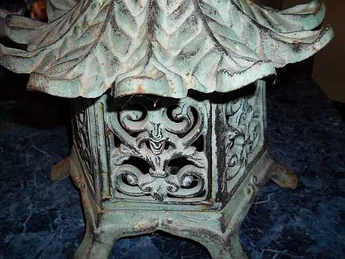
The Inspirational Pagoda
My first thoughts went to an old, broken metal garden pagoda that has been buried under the foliage in my little greenhouse sunroom for years. I pulled it out, cleaned it up and took photos. It was made to look like it was made of copper that had weathered with a nice patina… Fake, but I still like it, and the broken roof is easily hidden by plants or well cropped photos. I wanted to get that layered, weathered look but wasn’t sure how to get that idea to my cards. The first thought was to paint a piece of watercolor paper with copper Lumiere paint, modify the photo so that there were white areas where I wanted the copper to show through, print the photo onto the paper, and I would have what I was looking for…..
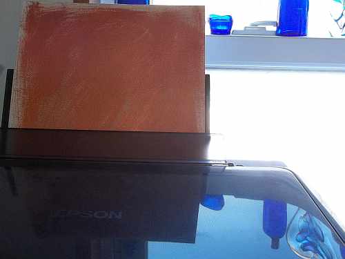
Copper Painted Paper in Printer- See my new Glass Heart reflected on the printer?
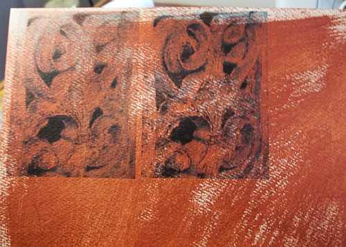
NOT! Thankfully, I only printed the photo for one card at first… It was Awful!
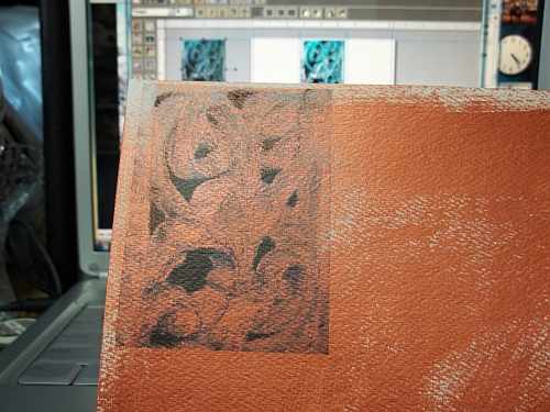
First Print… Notice photos on computer screen… Ikkk!
The pretty aqua coloring of the patina was lost and it was not a pretty sight….
Second Try After Modifying Photo… Still Ikkk!
I tried modifying the photo hoping that would help…. Still Ikk on try #2….
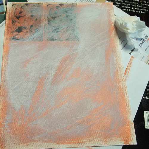
Titanium White added over the copper.
I then painted over the copper with titanium white in a random way and tried again… I hated to toss the paper….
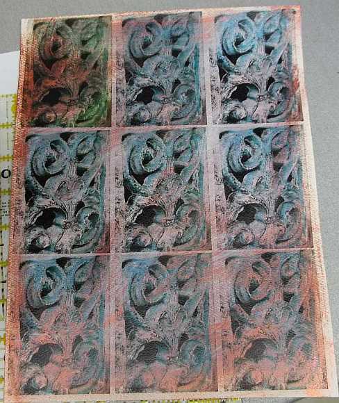
The Full Set of Cards Out of the Printer
Much better! I re-printed the first 2 cards #1 ended up off color… I now had the printed cards, but not the amount of copper I wanted to show and the color of the patina was wishy, washy….
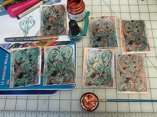
Cards in Various Stages
I pulled out my Inktense blocks and added the turquoise/aqua color, added some more copper paint with a small brush and used that to wet the Inktense pigment to set it. I highlighted the heart shapes with a black ink pen. I have been playing with shiny mediums, so I added some of my pearly aqua nail polish as highlights. I then outlined the heart shapes of the metal work with Ranger’s Glossy Accents over the black ink….
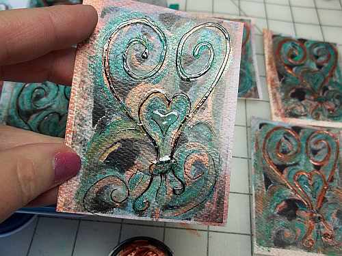
Oops! The Black Ink Wasn’t Waterproof…
I tried adding Pearl Ex pigment over the Gloss on the first card, but it didn’t work well. Copper Lumiere under the gloss didn’t give me what I was looking for either.
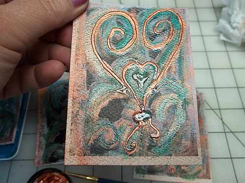
An Almost Finished Card… Needs More Gloss
I finally found that a layer of Glossy Accents over the ink, followed by a layer of the copper paint over the dried, raised gloss, then another layer of gloss over the copper gave me something I finally liked…. I also added extra nail polish to the little raised hearts in the center with more gloss on top to give it more of a jewel-like look.
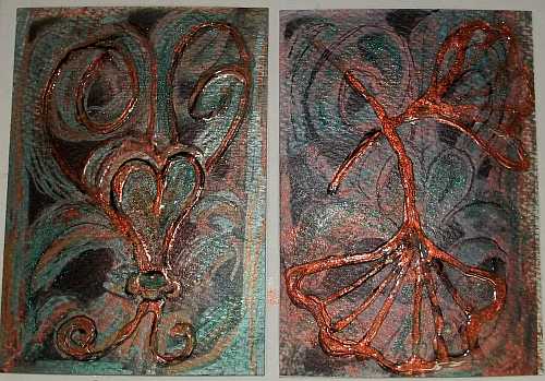
My “Keeper” and The Trial Card Not Chosen
In the photo above, is the first trial card that I used the Pearl Ex on then added more gloss over… It was the #1 card and also got some marker work to get to somewhat look similar to the others… The right card was another idea I tried by drawing ginkgo leaves with the Glossy Accents. By the time I got the copper and gloss layers “right”, I decided that the leaves hid the scroll-work I liked so much in the pagoda.
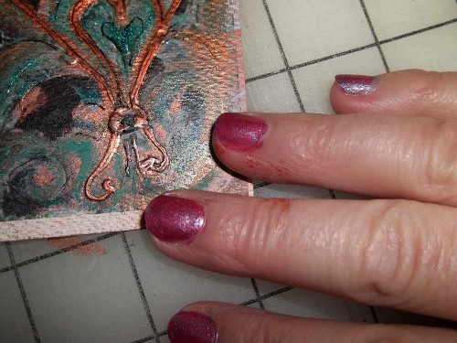
Ahhh, the Nails got painted again, not so neatly… So did the fingers.
So much for neatness… Paint on the fingers and somehow I ended up with some gloss on my glasses?? (Wow, my hands are looking like “old lady” hands…)
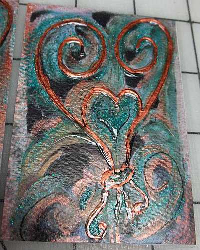
Finished Single Card
One of the finished cards… Photos are hard to get with so much shine on the cards… You can see the texture of the paper and much of the raised Glossy Accents….
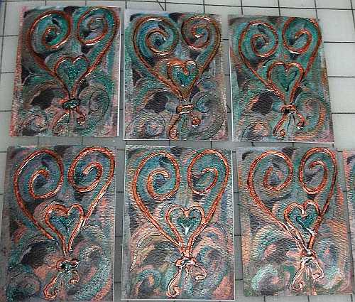
Group of 6 of This Group of Cards
I ended up with 7 “good” cards and the 2 test ones that didn’t turn out so well… Above shows 6 of the best ones that are now on their way to their new homes. Definitely another challenge, but I am slowly learning how some of my supplies work together, or not…. 😉
I am a former textile artist and new pattern designer with a degree in horticulture, wishing to share my love of nature, flowers and gardens with everyone through my photos, sunprinted fabrics, and now pattern designs. Chronic Lyme Disease has caused major changes to the direction my life. I have to limit the amount of time spent digging in my gardens, and quilting has become more difficult. I discovered pattern design as a way to get art back into my life. I now use my gardens and photos to inspire designs that can be used on fabrics and print on demand items.